Tailleur Bar, Now and Then

Before I start, let me state again that I am most definitely a Dior girl at heart. This was the beauty brand that I discovered on my own and although I explore other brands, I always come back to Dior. Browsing Tumblr earlier, I found this little jewel and wondered if Dior Beauty was losing its creativity:

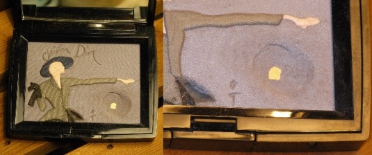
Now where have I seen this before? Oh wait:

Dior Tailleur Bar Palette

It wouldn’t have been so bad if they had the woman in a different position but to use the same cast and mould seems a bit on the cheap and uninspired side. Even the colours haven’t changed much. If they wanted to use the same mould, it might have been fine if they used it a few years down the road rather than two years later.  Last time around, this palette was available in Europe first in the spring before being available on North American shores during the summer in a set with the Dior Rouge Serum in Pearly Pink. Currently, the new palette, on its own, is available at Saks for $75.00, in numbered limited editions complete with the white pebbled box for the summer.

Given that this is practically the fraternal twin of the original, I am debating on whether to purchase this if it does happen to cross the Canadian border.

EDIT: I have the colour listing. The original 2010 one came with Blissful Pink, Whisper Grey, Anthracite Black, Storm Blue and Dawn Grey. The 2012 one comes with Dawn Grey, Sand Beige, Whisper Grey, Blissful Pink and Anthracite Black. Two years and only one colour difference. If you have the original and find that you’re using some colours faster than others, this is a good way of evening it out by getting the second palette. If you were expecting something different, you’re only getting the slightest of a variation.

Smashbox Photo Finish Balance

As I’ve mentioned before, I have a bit of a love/hate relationship with Smashbox primers. Photo Finish Balance is no different. I am curious to see how the new Photo Finish Hydrating one will work in comparison to its predecessors but for now, I’m working on finishing the Photo Finishes I have now. Again, I have this in the older packaging with the bottle rather than the newer version in the squeeze tube.

According to the product description:

“Color correcting, wrinkle reducing, and dark spot defying – talk about a miracle product! Create a perfect canvas for foundation application and even out skin tone with this silky, lightweight blend of antioxidants and vitamins A & E. The formula helps to reduce the appearance of fine lines and pores for visibly softer, younger-looking skin. Wear under foundation or alone for a velvety-smooth finish. Now in a sleek tube for perfect dispensing down to the last drop! BALANCE is lavender-toned to brighten dull or sallow skin.”

Dull or sallow skin is usually shown when your skin has a bit of yellow to your skin. The lavender shade neutralizes the yellow, similar to how red and green cancel each other out. Unlike green, lavender shades tend to give you a boost in complexion by reflecting more light off your face.

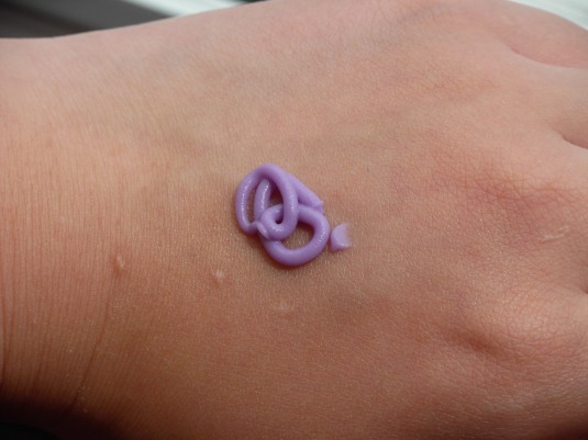
Out of bottle, it pumps out purple but once you apply it to your face, it will go on translucent. It does not cover up acme scars but it does give a smooth base, provided your skin is well-moisturized. This isn’t the best brightening primer out there as I didn’t find it brightened my skin so much as bleached my skin. I use a smaller amount than one regular pump to prevent my face from becoming  rather pale compared to the rest of my body before I apply foundation. As for the lasting time, I did become oily but my foundation does stay on. I will say I have seen better primers. I have a feeling this would work better for someone with a lighter skin tone. If you’re looking to hide red acme marks (this was recommended by an SA when I had been looking at the green version), this won’t work for the pimples or the scarring afterwards. Given the amount of preparation I need for my face for this primer, I find it too high maintenance to use continuously.

Elizabeth Arden Pine

Elizabeth Arden’s Smoky Eyes Powder Pencil in Pine was among the first eyeliners I bought for myself after I stopped relying on the ones given in GWPs. I was going to aim for black because you can almost never go wrong with black when the SA (whom I’ve known for a long time since she’s known me since my first makeover through my mother) suggested Pine, a charcoal gray with deep green tinge when the light hits it just right. It’s less harsh than black but still dark enough to make the eyes pop.

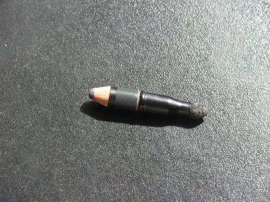
As you can see, Pine is on its last rungs of life. I predict I have maybe a sharpen or two left before I am done. Towards the end when I was pushing the pencil into the sharpener, the smudge brush started pulling out a bit. I’ve removed it now to get a better grip on the pencil to sharpen and will probably attach the smudge brush to something else to be used on its own.

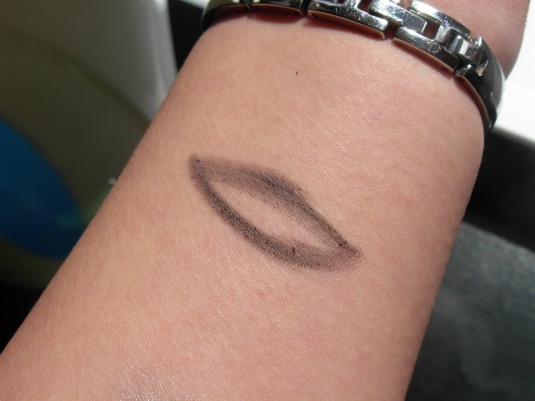
It is one of the softest eye pencils I’ve ever used, no tugging required. However, the only drawback I’ve found is that it smudges very easily. If you’re hoping for a sharply defined eyeliner, this is not the eyeliner for you. I mostly use it for smoky eyes or as a base for blending in other colours for a smoky look or otherwise.

Finished Edition Vol. 1

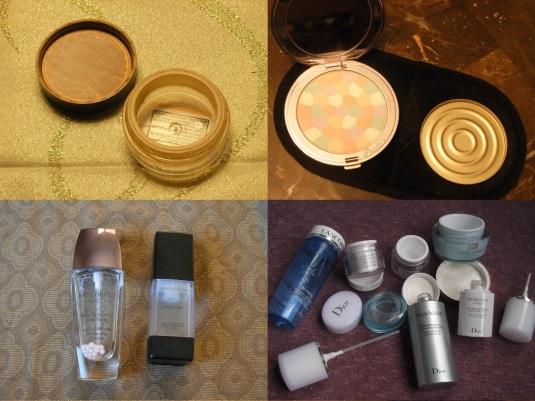
It takes time to finish but when things are finally done, the feeling is definitely worth it. To save space, I made a collage of all the items I’ve finished by this day.

Going around clockwise from the top left, we have:

  • Bare Escentuals bareMinerals SPF 15 in Medium Beige,
  • Guerlain Voyage in Mythic (the compact is the Radiant Butterfly one with a new Mythic refill pan),
  • Skincare lot with Lancome Bi-Facil Double-Action Eye Makeup Remover, two deluxe sample jars of Bienfait Multi-Vital SPF 30 High Potency Vitamin Enriched Daily Moisturizing Cream, Estee Lauder DayWear Plus Multi Protection Creme SPF 15, Diorsnow Pure Whitening Radiance Treatment, Dior HydrAction Deep Hydration Radical Serum and deluxe sample jar of Dior HydrAction Hydra-Protective Light Creme SPF 20,
  • Smashbox Photo Finish Foundation Primer and Guerlain Meteorites Light-Diffusing Primer (this was taken before the bottle neck was broken so I could get that last bit).

Guerlain by Emilio Pucci: Summer 2007

Beauty collaborations with fashion houses is not a new concept as we have seen in the past with MAC and Alexander McQueen or how fashion houses created their own beauty lines such as Dior, Chanel and Armani. The House of Guerlain started out in perfumery before branching out into make-up.

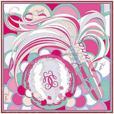
Guerlain by Emilio Pucci scarf

In the summer of 2007, the Parisian House of Guerlain partnered with the Florentine House of Emilio Pucci to create a unique collection, a first for both companies as Guerlain’s first partnership and Pucci’s debut into the world of cosmetics. The process started with a scarf from which the key colours for the make-up were inspired from.  Olivier Échaudemaison, Guerlain’s creative director, worked directly with Pucci’s image director, Laudomia Pucci to translate the imagery of the scarf into a makeup collection. “It’s not just about wrapping something in a Pucci print,” said Pucci. “Our first step was making a scarf, something that would give focus to the entire project. I can’t visualize anything without a scarf!”

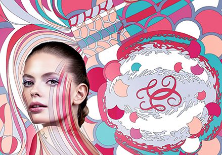
Guerlain by Emilio pucci

Pink, coral, fuchsia, apricot, aqua, lavender, gold and white infuse swirled together into a print style classic of Pucci might sound intimidating but a goal of the project was to make these colours wearable. “First of all, it was clear that this would not be runway makeup,” said Échaudemaison. “You know, on stage, things are very theatrical and extreme. But life is not a fashion show. I’m careful to separate those two worlds. The most important thing is making women more beautiful. Our mission is to create dreams.” The advertising and in-store imagery has the iconic Pucci print projected onto Julia Stegner’s body so that the essence of Pucci seems to permeate her skin. “I love that Julia’s face is so adorable and naturally enhanced,” said Échaudemaison. “The nod to pop art and the body painting are close to Laudomia’s heart, and both capture this exciting collaboration.”

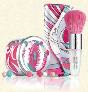
Guerlain by Emilio Pucci Meteorites Perles and brushGuerlain by Emilio Pucci lipglosses and mousse blush

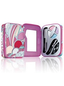
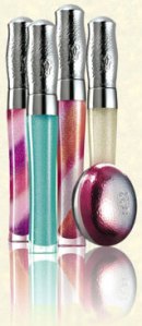
This collection consisted of  eight pieces (ten if you include the scarf and the gift with purchase mirror also in the same print): an eye coffret with four eyeshadows, two eyeliners, two sponge applicators and a mascara all inside a mirrored case; four lipglossses in no. 02 Sparkling Sun, no. 03 Sparkling Sea, no. 04 Twist of Pink,  and no. 05 in Twist of Peach; Meteorites in Pucci Perles as well as a Meteorites brush with its own case and finally an apricot mousse blush. All of the items were in boxes where the insides were printed with collection’s print.

If you enjoyed this collection (or missed out on it), you will be happy to hear that Guerlain and Pucci are teaming up again for 2012, five years later and in another summer collection entitled Terra Azzurra. Instead of colours reminiscent of cotton candy, the focus will be on richer colours such as a deep indigos, vibrant pinks, browns and teal.

The History of Dior in Palettes

In a moment of contemplation, Dior’s image palettes didn’t hit the scene until 2008 with the Flower Blossom palette. This was followed by the Tyen’s Love Dior coffret released in 2009. In 2010, we saw Renee Grau’s Tailleur Bar coffret released. Nearing the end game of 2011, two more image palettes have been released: the Mitzah Bricard and the Lady Dior. One thing they do have in common though, is their illustration of the House of Dior’s history.

When it comes to image palettes, the most common complaint is that of overspray. The beauty of these palettes in additional to their loveliness is that their elaborate patterns go all the way down to the pan, a testament of their handmade background rather than being mass-produced; I can vouch for this from personal experience with these palettes. As such, these palettes came under an extremely limited runs of 5,000 pieces or less per palette. Here’s a video demonstrating the process for making the Tailleur Bar:

You can see from this process why all the palettes after Flower Blossom were on a very limited run of 5000 worldwide, each set being numbered, though I suspect it might have been because the Flower Blossom didn’t sell very well as I remember it still being available in some department stores till the winter, three seasons after it was released.
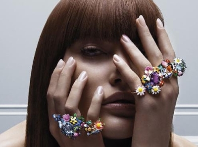
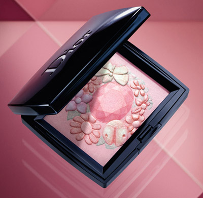
Dior Flower Blossom Palette
This one inspired by Victoire de Castellane’s famous “Diorette” jewelry collection. The colours of this palette were very pale but on someone with lighter skin tones, they might have shown up better. However, the powder was very fine with a smooth shimmer not outright glitter. I think part of the problem was the lack of pigmentation and the other was that it was very beautiful, maybe too beautiful to use that deterred people from buying it even though it costed the same amount as a regular Dior eyeshadow quint. This was intended to be used as both an eyeshadow and face palette, primarily as a blush and/or highlighter.
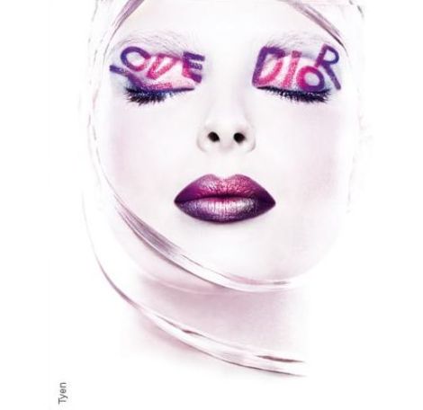
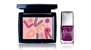
Tyen's Love Dior LookLove Dior Palette

The Love Dior was presented in a set with lovely white pebbled texture boxes with a specially made shade of nail polish no. 928 Love. It was made to honour 30 years of make-up artist Tyen has been with Dior as a homage to a famous look he did on a model once with the words “Love Dior” over her eyelids. While the palette does reflect the colours used in the “Love Dior” look, the polish was a more versatile choice to customers since purple and deep magenta berry lip colours wouldn’t appeal to everyone. Like the Flower Blossom, the Love Dior palette could also be used as face palette or as an eyeshadow one. The limited run ensured that the product would sell out and the darker pigmentation made the colours more appealing to a wider range of skin tones compared to its predecessor. By far these sets are the hardest to find still new.
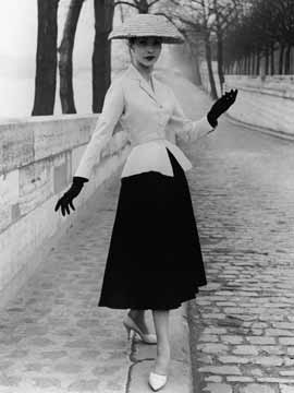
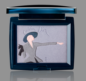
Dior Tailleur Bar Palette

Based off of the success of the Love Dior, the following year the Tailleur Bar set was released. Tailleur Bar, French for the Bar Suit, was what had launched Christian Dior into fame in 1947. The actual image on the palette was based on a sketch Renee Grau made to bring Monsieur Dior’s vision of the Bar Suit to life. Dior couldn’t draw but he could imagine while Renee at the time was famous for his artwork in advertisements. Instead of a nail polish, this came with a Rouge Dior Serum in no. 470 Pearly Pink which was also released as part of the Dior’s Fall 2010 make-up collection.

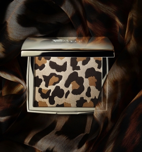
Dior Mitzah Bricard Palette

The release of the Mitzah Bricard palette was unlike its predeccessors, much like the woman who inspired the palette. This was the first not to be made in a set with another product but was made as part of a mini collection, and not only that, the box it came in was different. The case was metal, like that of the Dior Lace palettes of Spring 2010, the box was black instead of the pebbled white boxes of its predecessors and it came with a small eyeshadow brush with its own velvet sleeve. Although standard for Dior’s other compacts, the velvet pouch that came with it was new as the previous two numbered sets didn’t come with one. What differentiated these pouches were that they had a leopard print lining within them. This same lining appeared with the limited edition 5 Couleurs eyeshadow palette no. 753 Mitzah, which was only available in Sephora in Canada and the U.S along with the Diorshow mascara in Golden Brown. Other products of this mini collection were the nail polishes no. 912 Ebony and no. 622 Camel which were available in wherever the Mitzah Bricard palette was sold.
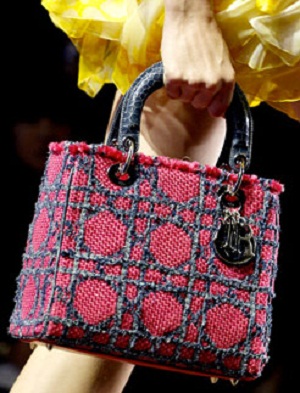
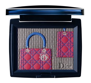
Lady Dior PaletteThe latest offering is the newest revamp of the Lady Dior bag. Though composed mainly of tweed, the handles were made from crocodile. The bag was part of the Spring/Summer 2011 show, where plenty of Lady Diors got a colour lift in bright tropical shades. This bag is also prominently featured in the Lady Dior ads in Russia featuring Marion Cotillard. Like the Mitzah Bricard, there was only the palette with no accompanying item except for an eyeshadow brush with its own velvet sleeve.

Finally we have next spring’s offering, the Anselm Reyle palette:
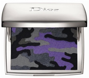
This palette is a collaboration made from Dior’s partnership with German artist Anselm Reyle in tribute to Christian Dior’s previous career as a gallerist and even once he became a visionary couturier, Dior still kept art close to his heart. This palette will be released with five limited shades of nail polish in Ultra Violet, Pink Graffiti, Electric Blue, Metallic Silver and Untitled Black. Both the palette and nail polish range will be part of a larger Anselm Reyle accessories collection. All items will be launched in January 2012.

Hitting the Pan Vol. 1

Hitting the Pan posts are exactly as the title says, posts of items that I’ve hit pan recently on. This first post is one of the exceptions as these items I’ve either hit pan at the beginning of this year or earlier.

To start off with:

Dior Tailleur Bar

Guerlain Terracotta Light in Brunette

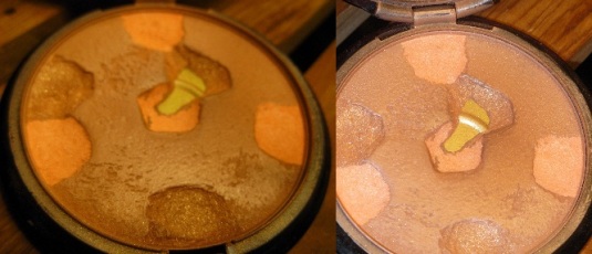
Guerlain Voyage Radiant Butterfly with a refill pan in Mythic

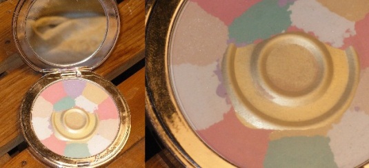
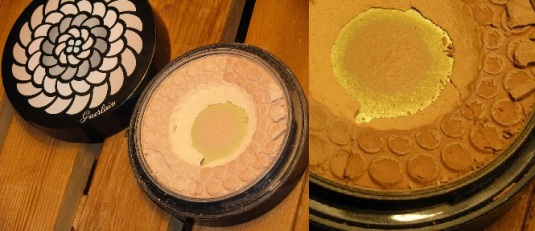
and Guerlain Meteorites in Beige Lumineux.